
A Rotation Lower in the Short Term Forecast
Analyzing this recent unusual pattern

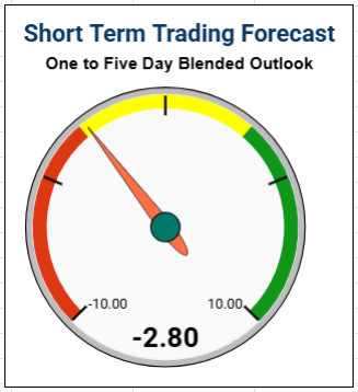
The forecast gauge rotated a bit lower after today’s strength in the market.
We have a bit of a binary event with NVDA earnings after the close tomorrow. This sits somewhat in the middle of our blended one to 5 day short term outlook timeframe.
For those that don’t know the forecast model tries to find days in SPY history that had a similar historical technical structure.
We’ll have to see what that event brings us. Your guess is as good as mine.
I’m pretty wiped out tonight as I’ve been dealing with the clean-up of the snow storm here in Connecticut. We received about 18” inches of some seriously heavy packed snow. If this storm was fluffy I swear it would have been 5 feet of snow.
I was also finishing the backend to the Bear Hunter spreadsheet and documentation which has some serious calculations going on under the hood. Trust me, trying to get all the math on the sheet to match that of my backtesting platform was no easy task. These are not your off the shelf type indicators and the math is not always particularly clear at the source.
Without much energy to give, I figured we’d have a little fun with the current funky pattern in the SPY
The last 3 days in the SPY has printed a somewhat rare pattern where we had fairly strong up day today, a fairly weak day the prior day, and a fairly strong day 3 days prior, AND the 2 day rate of change is negative.
I designed my candle matching algo in Wealth-lab to find similar patterns while being above the 150 period moving average.
It look’s like this…
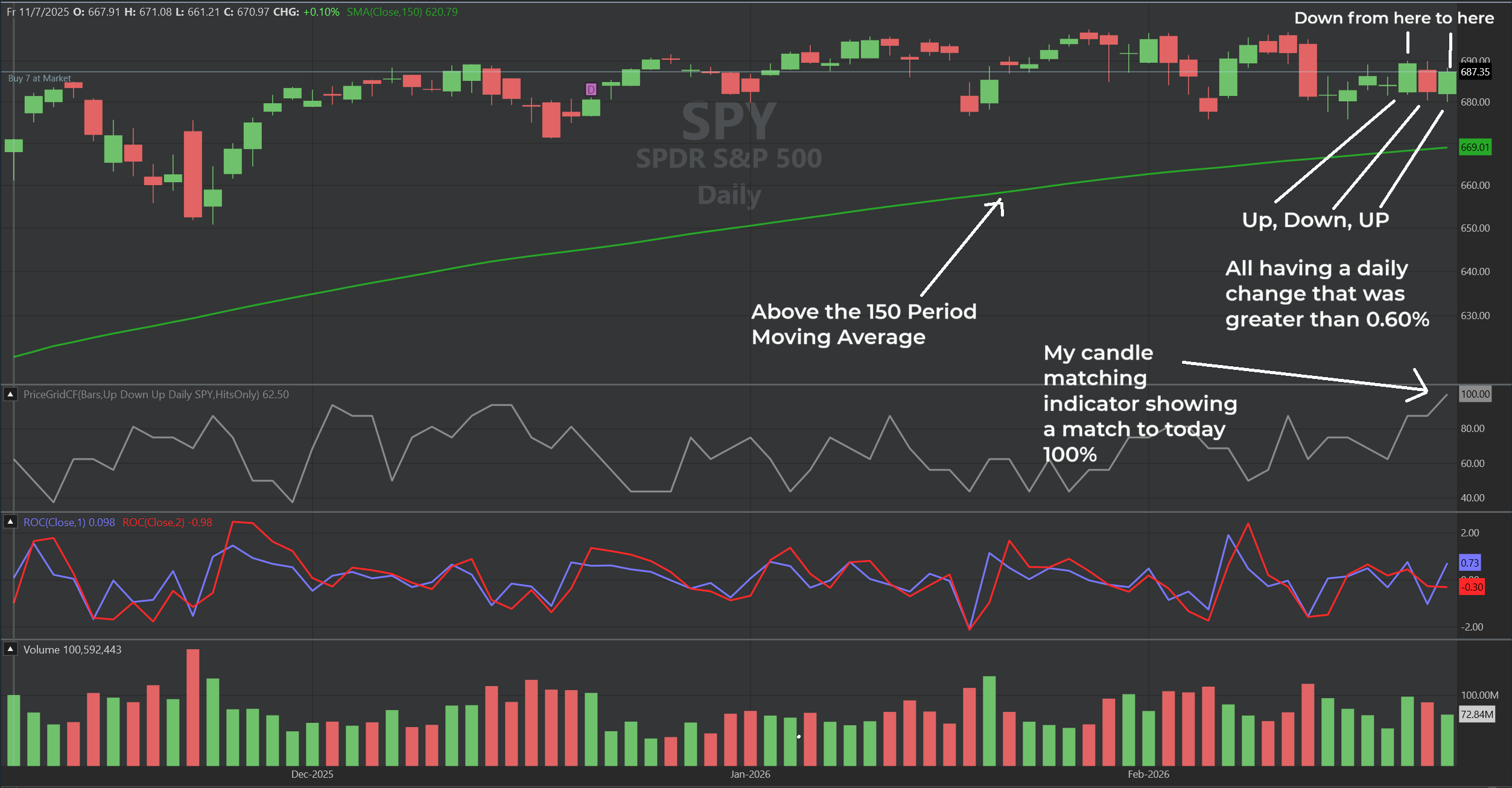
The 3 matches I found were all from 2003, during the post-Dot Com rally. None of them occurred near all-time highs, making them difficult to compare directly with the current market, which sits within 3% of its all-time highs..
I then figured I’d run this pattern on all S&P 500 stocks over the last 30 years to see if anything stood out.
I set the candle matching indicator to 95%
Asked that a stock needed to be within 5% of it’s all time highest price
It must be above its 150 period moving average
the percent change for each of the 3 past days needed to be greater than 0.6% plus and minus (up, down ,up)
the 2 period period percent change is less than zero.
This defines the rare pattern were are seeing in the SPY but now we can find it in individual stocks. Woohoo!
Sometimes when you go off on little tangents like this you find something. Either really good or really bad. I like both of those scenarios because they can lead to deeper research trying to find edges in data.
Did we find something?
Historically the rules found 410 matching “trades”.
If we were to buy the next day at the open and hold for 2 days we get the following stats:
45% Win Rate
Average Winner 1.42%
Average Loser 1.72%
Profit Factor 0.68 (net negative)
A pretty good negative lean there.
Let’s look at holding 3 days
48.53% Win Rate
Average Winner 1.80%
Average Loser 2.24%
Profit Factor 0.75 (net negative)
Let’s do a 5 day hold
51.47% Win Rate
Average Winner 2.3%
Average Loser 2.72%
Profit Factor 0.89 (net negative)
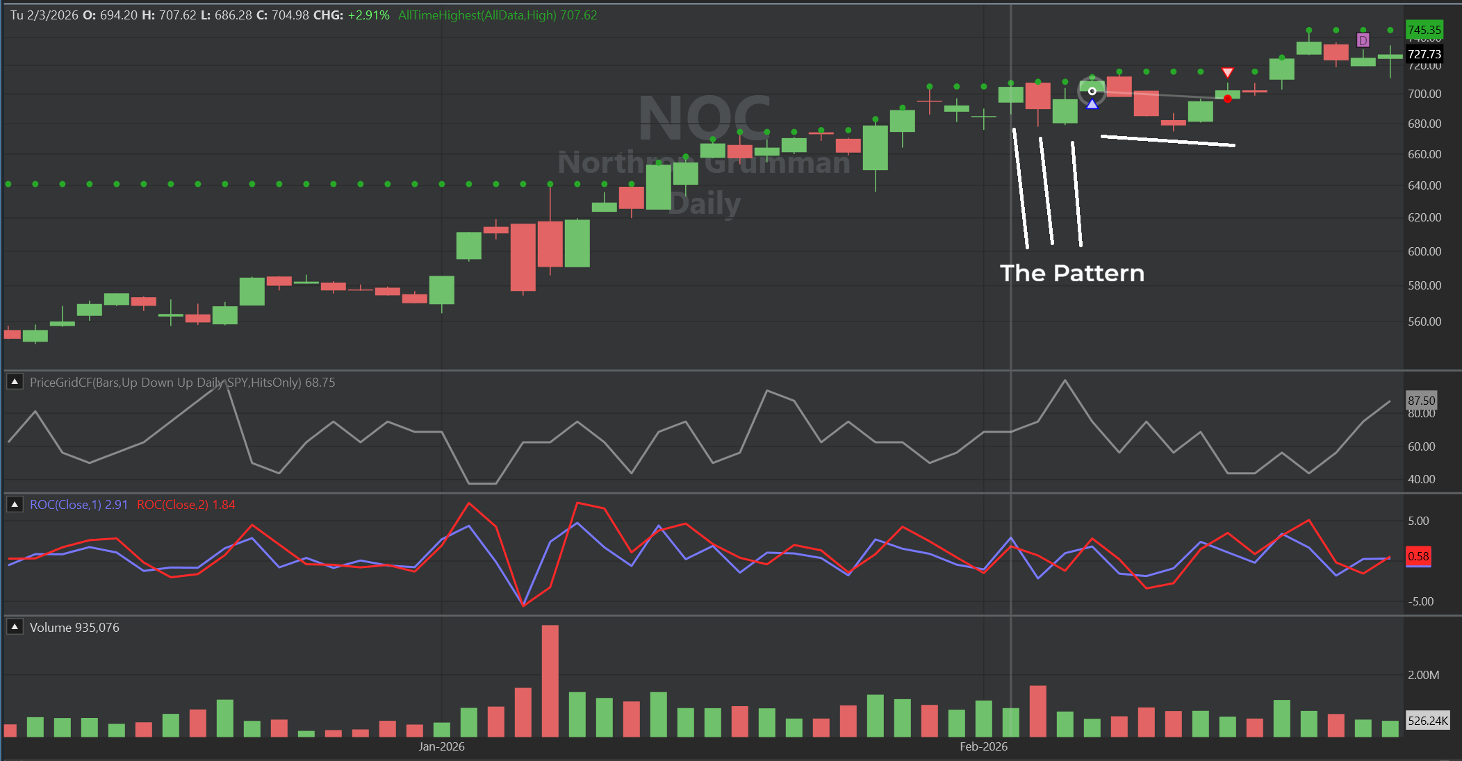
The last trigger was recently in FDX was winner
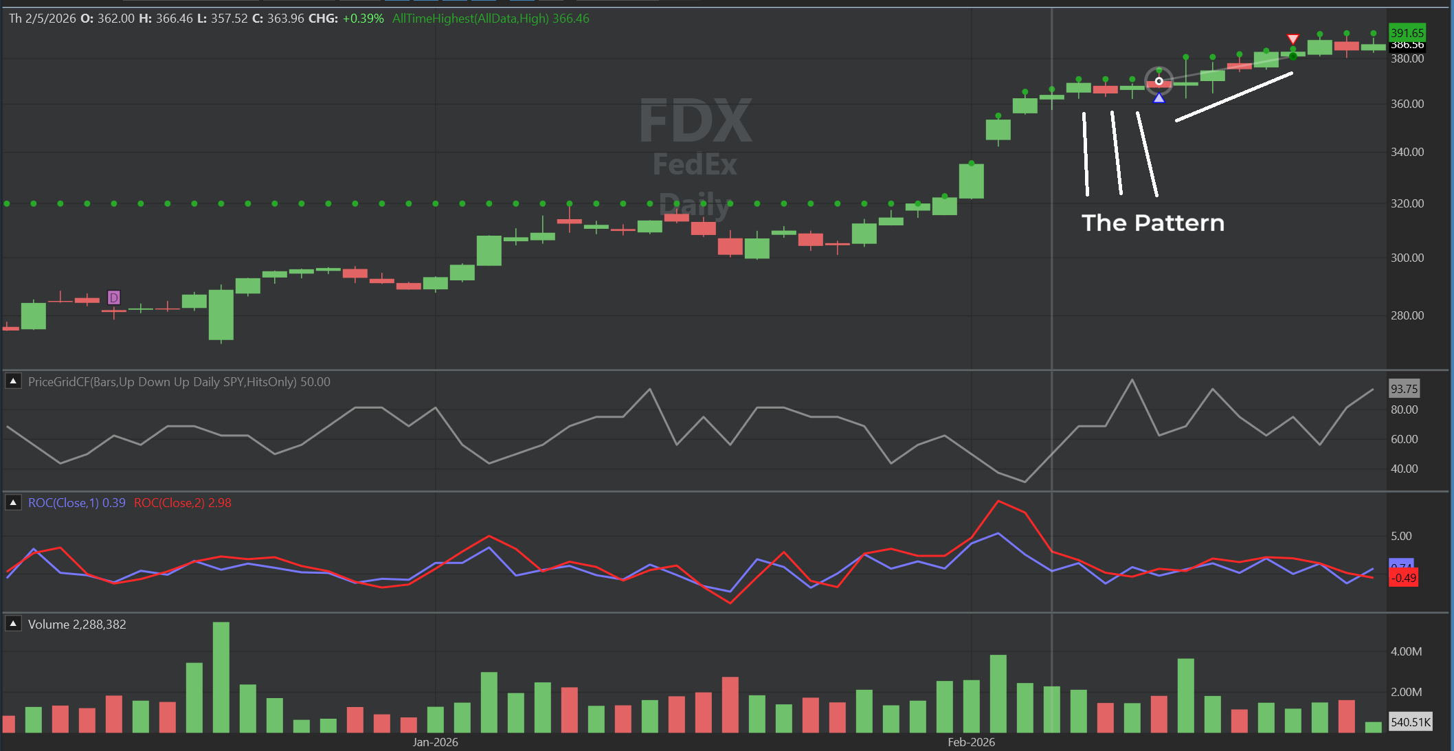
The trade before that was in NOC, a loser
Let’s take a look 21 days later
53.71% Win Rate
Average Winner 4.78%
Average Loser 5.12%
Profit Factor 1.08 (went net positive)
Did we find anything?
Not really. The pattern really just represented what you would see with random entries in a strong market after a fairly strong up day. The average winners and loser and win percentage are almost exactly the same.
Weakness in the short term
Strengthening with time
The pattern was not a defining feature in any way.
Now I’m feeling kind of bad I dragged you along to a dead end.
In data finance research most of the time that’s where it leads.
True statistical edges are extremely rare. It leads to many dead ends.
Of the gazillion ideas I’ve tested only a small fraction ever make it to the stage where I will continue my work on the idea. Then a large percentage of those end up in the dumpster. Its frustrating but the rewards drive me today 30 years later.
I love this stuff.
If you’re seeking an edge to navigate high volatility regimes, I highly recommend exploring the Bear Hunter system’s data. I’ve shared everything from every historical trade, statistics, return profiles, and more. I’m currently bringing in 20 people to stress test the spreadsheet, identify any documentation inconsistencies, and address questions as I prepare to roll it out of beta. I need you to tell me why it is NOT an amazing tool to have in your arsenal. You have all the data to prove that. Check it out.
OK I am heading to bed.
Have a Great Night!
Dave Johnson - Quantitative System Designer at