
Visualizing Your Path
A Free Monte Carlo Simulator

The Reality Behind the Numbers
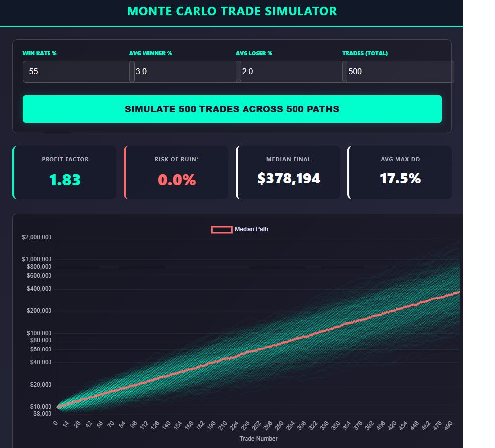
I often talk about the core building blocks of a system: a Win Rate of X%, an Average Gain of X%, and an Average Loss of X%. Together, these numbers compute your Profit Factor, a vital metric for any quantitative edge.
However, the Profit Factor is only one piece of the puzzle. It tells you the destination, but it doesn’t show you the path.
In the markets, the order of your wins and losses is entirely random. To some, these percentages are just numbers on a screen; to a quant, they are the foundation of survival. I built the Monte Carlo Trade Simulator below to move beyond the backtest and reveal the statistical range of what you might actually experience over a 500-trade sequence.
By reshuffling your trade outcomes into 500 unique simulations, this tool demonstrates how your stats actually compound, or fail, across 500 different versions of the future. It highlights the Median Path of expectation and the sobering Risk of Ruin that can hide behind even a profitable system.
Don’t take my word for it. Input your stats, run the simulation, and let the math tell the story.
It is on the Trader Tools page of my site under the Voice and TickStrike widget.
https://www.tradingtimemachine.com/trader_tools.html
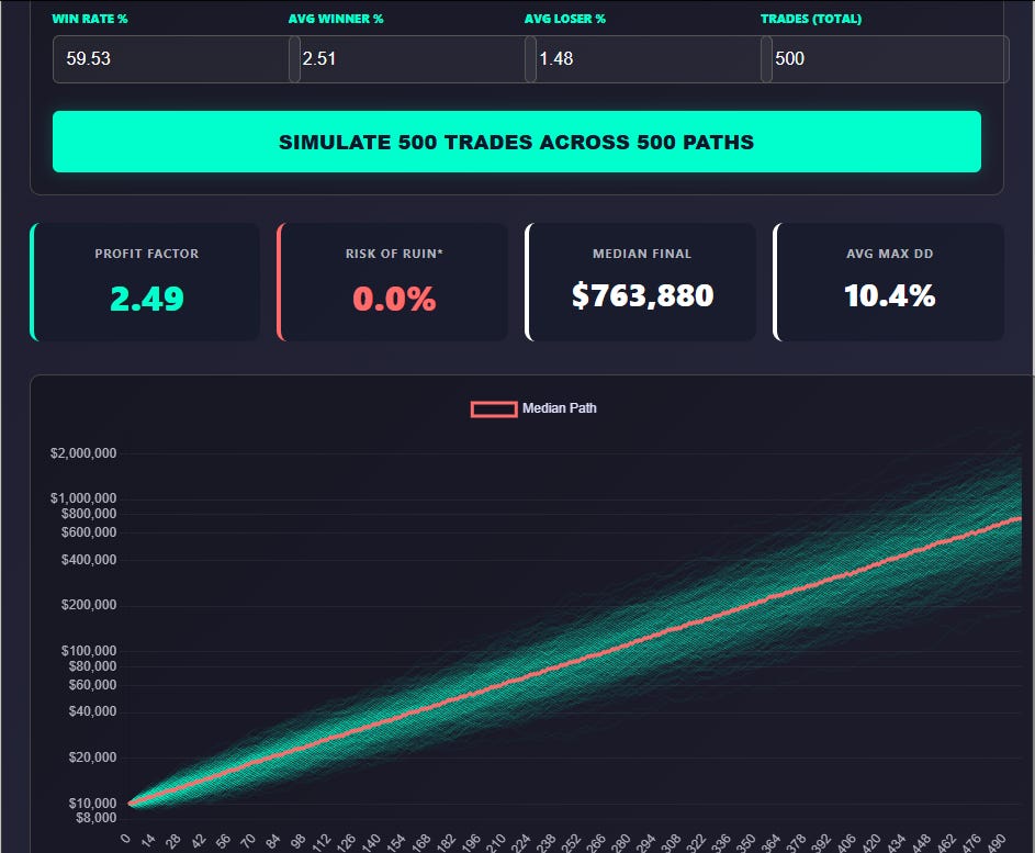
For reference we could input the stats for the Bear Hunter System (which still has 7 Beta Slots available)
Win Rate 59.53%
Average Winner 2.51%
Average Loser -1.48%
That gives us the following visual Monte Carlo output:
Pretty cool. Try popping in some stats to help you visualize those over time.
If there are any tweaks you’d like to see added, feel free to comment below.
Dave Johnson - Quantitative System Designer at